
Kitchen Color Schemes: 15 Budget-Friendly Ideas for Beginner Homeowners
Kitchen Color Schemes play a crucial role in setting the mood and style of your home, especially for beginner homeowners looking to make a budget-conscious impact. Choosing the right palette can transform your kitchen space into a welcoming environment that reflects your personal taste without overspending. This article covers 15 practical color scheme ideas tailored for Canadian homes, emphasizing simplicity and affordability. Whether you prefer neutral tones or bold contrasts, these schemes offer diverse options to help you visualize and execute a stylish kitchen update within your means.
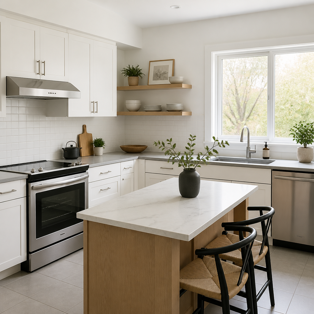
Neutral White Palette
Choosing a neutral white palette for your kitchen walls and cabinetry creates a timeless, airy atmosphere ideal for small or dimly lit spaces. White reflects light, making the room appear larger and cleaner without overwhelming your budget.
Pair this scheme with natural wood accents or soft gray countertops for subtle contrast. Simple white tones provide a clean backdrop that accommodates seasonal decor changes, making it practical and flexible for beginners exploring kitchen color schemes.
Cool Blue Accents
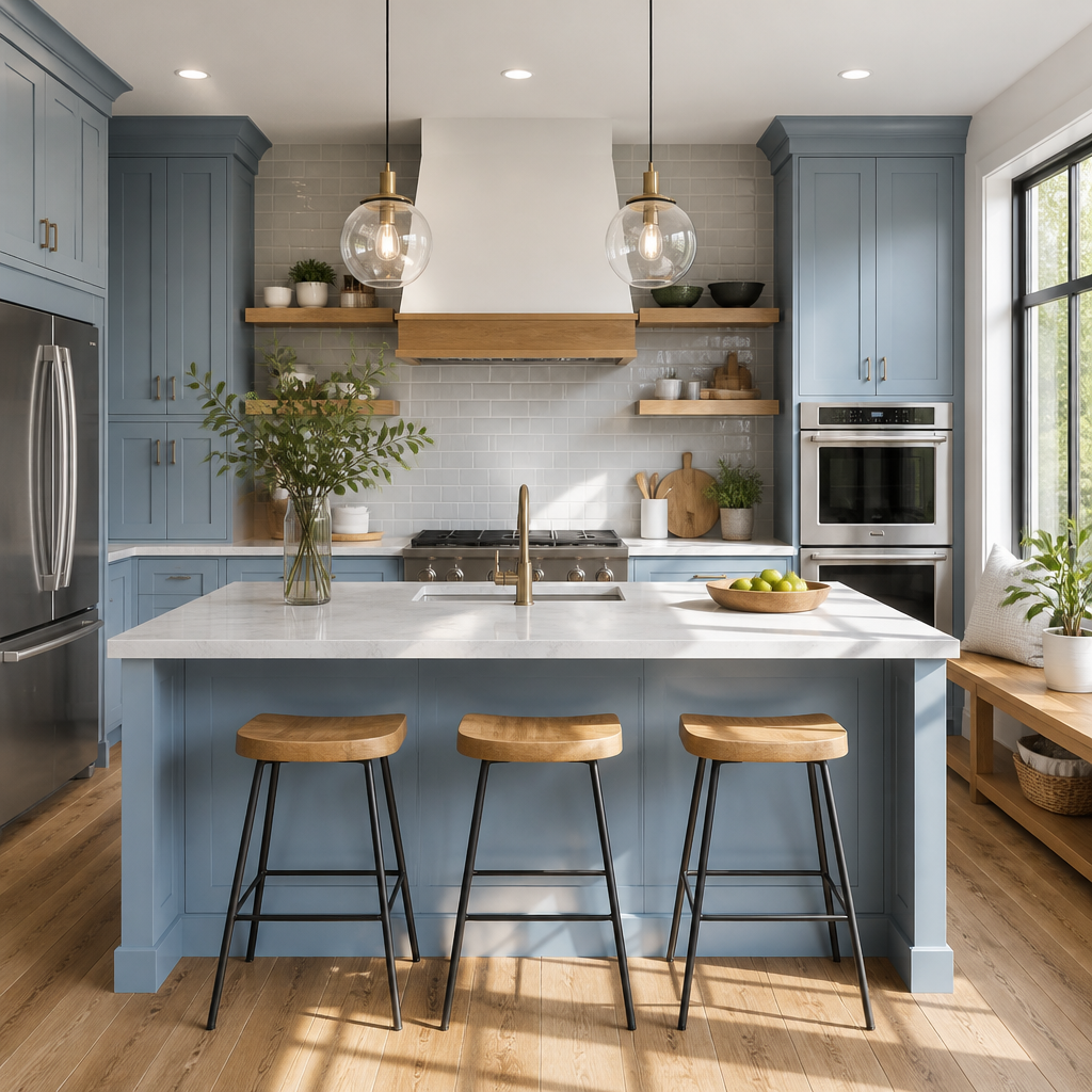
- Incorporate cool blue cabinetry or a backsplash for a calming effect in your kitchen.
- Pair blues with light grey or white countertops to keep the space fresh and balanced.
- Use natural wood elements to add warmth alongside the cooler tones.
- Choose matte finishes on cabinets to reduce glare and create a relaxed ambiance.
Choosing cool blue accents can revitalize a kitchen with freshness and tranquility. This combination works well for budget-conscious homeowners seeking an inviting atmosphere without overwhelming color. Small touches like hardware in brushed nickel can elevate this scheme affordably.
For more related ideas, explore 10 Modern Brown Kitchen Cabinets.
For guidance on securing furniture, see CPSC furniture anchoring guidance.
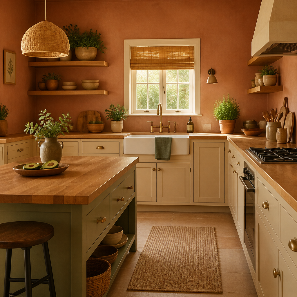
Warm Earth Tones
Quick Tip:
Choose warm earth tones like soft terracotta, sandy beiges, and muted olive greens to create a cozy, inviting kitchen atmosphere. These colors work well with natural wood cabinetry and enhance ambient lighting for comfort.
Incorporating warm earth tones can add depth and warmth to your kitchen without overwhelming the space. These hues complement budget-friendly materials and simple décor, making them an excellent choice for beginners aiming for both style and practicality in their home kitchens.
For help choosing lighting, consult U.S. Department of Energy lighting guide.
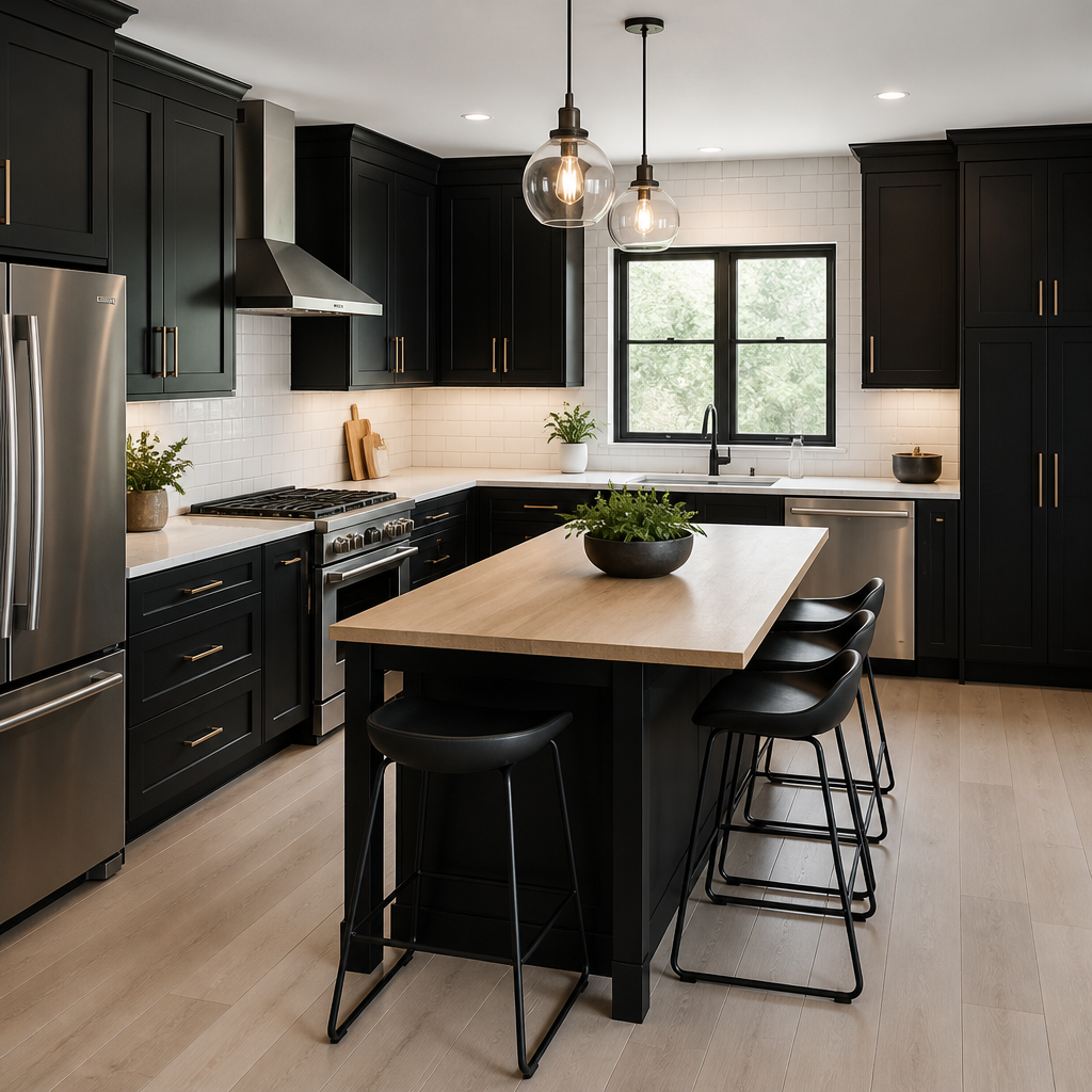
Bright Contrast Makeover
Before:
The kitchen previously featured dull, beige cabinetry that blended with the walls, creating a muted and uninspiring atmosphere. Lighting was minimal, making the space feel smaller and less welcoming.
After:
After introducing bold black cabinets contrasted with crisp white countertops and walls, the kitchen feels modern and vibrant. Enhanced lighting brightens the space, making it appear larger and inviting for everyday cooking and gatherings.
This transformation shows how contrasting colors can redefine a room's ambiance without expensive renovations. With strategic lighting and careful color choice, a kitchen can move from outdated to stylish, proving practical updates make a big impact for budget-conscious homeowners.
For more related ideas, explore Black and White Kitchen Ideas: 10 Stylish Options for Renters.
Five Steps Fresh Palette
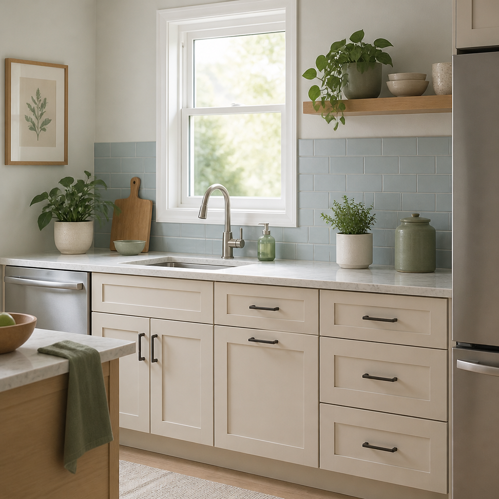
- Start by selecting a dominant light base color such as soft beige or pale gray for the walls and cabinetry.
- Introduce a secondary color for accents, like muted green or pastel blue, to add subtle interest.
- Use complementary tones in your countertops and backsplash to tie the palette together without overwhelming the space.
Finishing touches like matching hardware and coordinating textiles create a balanced and inviting kitchen. These five steps provide a practical, budget-friendly approach to refresh your kitchen’s look with a new, cohesive color scheme.
Classic Neutrals vs Bold Colors

| Point | Classic Neutrals | Bold Colors |
|---|---|---|
| Compare classic neutral kitchens with bold color kitchens to decide which suits your style and budget. | Classic neutral kitchens use shades like beige, gray, and white for timeless elegance. | Bold color kitchens embrace vibrant hues like deep blues, reds, or greens for striking visuals. |
| Assess maintenance and longevity for each color approach before committing. | Neutral palettes tend to show less wear and are easier to update over time. | Bold colors may require more upkeep and careful coordination with decor items. |
| Consider how each option affects kitchen lighting and space perception. | Neutral tones brighten the space and make it feel larger and more open. | Bold colors create focal points but can make the room feel smaller if overused. |
Choosing between classic neutrals and bold colors for cabinetry can shape your kitchen's look and feel. Consider your lifestyle, maintenance willingness, and the atmosphere you want to create. Both choices can be budget-friendly when planned well and can suit a variety of kitchen sizes and styles.
Balanced Color Choices

Do:
- Choose color combinations that complement each other to create a harmonious kitchen environment.
- Incorporate both light and dark tones to add depth and maintain visual interest in the space.
- Test paint swatches on walls before committing to a color to see how it looks with your lighting conditions.
Don't:
- Select colors that clash or overwhelm the kitchen space causing visual discomfort.
- Rely solely on trending colors without considering your kitchen's size or natural light availability.
- Ignore the impact of cabinetry and countertop colors when picking wall paints.
Choosing balanced color combinations enhances both the look and feel of your kitchen. It helps avoid overwhelming the space and creates a pleasant environment for cooking and gathering. Keep lighting and existing materials in mind for the best result when planning your kitchen colors.
Essential Color Guidelines
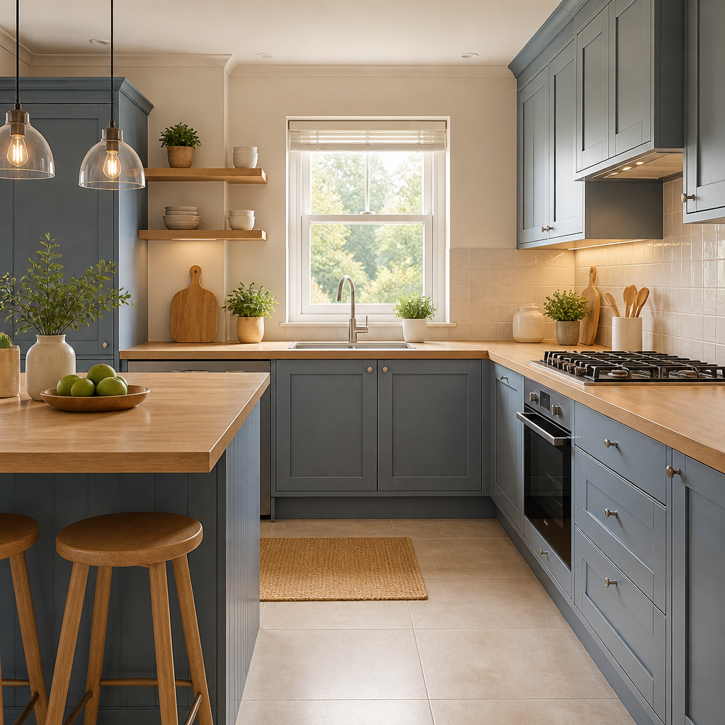
Harmony: Choose colors that complement each other to create a cohesive look in your kitchen.
Lighting: Consider natural and artificial lighting as they affect how colors appear throughout the day.
Balance: Distribute colors evenly between cabinetry, walls, and accessories to avoid overwhelming the space.
Applying these fundamental guidelines ensures a well-coordinated kitchen that feels inviting and functional. Focus on harmony, lighting, and balance to successfully design within your budget. Thoughtful color choices provide a pleasing environment that enhances daily living and increases overall satisfaction with your kitchen space.
Soft Gray Foundations
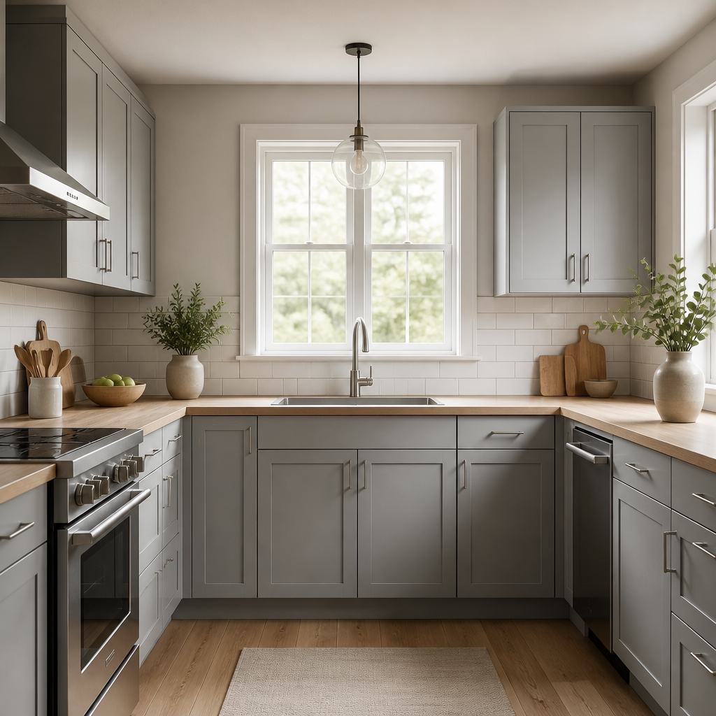
Incorporating soft gray cabinetry sets a calming tone while remaining versatile enough to pair with many textures or accent colors. This subtle base allows for flexible styling updates without major renovations, making it ideal for a budget-conscious kitchen makeover.
Use warmer grays to invite coziness or cooler shades for a sleek, modern vibe. Adding metallic hardware in brushed nickel or matte black can enhance depth. Combined with warm wood surfaces or bright white countertops, soft gray cabinets complete a refined yet approachable kitchen ambiance.
Modern Monochrome Style
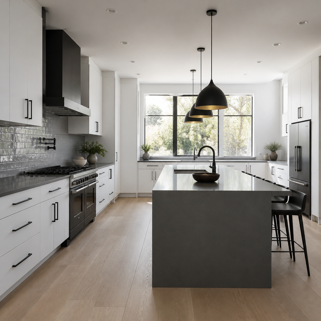
- Choosing a monochrome color scheme can simplify decisions and create a cohesive kitchen look.
- Black, white, and shades of gray offer timeless elegance for modern kitchens.
- Incorporate textures like matte cabinets and glossy backsplashes to add dimension within a single color family.
- Accent with metallic hardware or natural wood elements to avoid a flat appearance in monochrome palettes.
Using a modern monochrome style is budget-friendly and effective for creating a sleek kitchen atmosphere. This approach reduces the complexity of matching multiple colors and focusing on light and material variations ensures the space remains inviting and functional.
Simple Color Tips
Quick Tip:
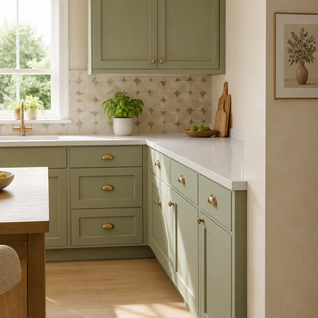
Choose two main colors and one accent shade for a harmonious kitchen palette that keeps the space balanced and visually appealing.
When selecting your kitchen colors, focus on simplicity and balance, especially if you're budget-conscious. A well-chosen trio of colors can refresh the space without the need for expensive renovations. Careful color pairing makes maintenance easier and ensures your kitchen remains inviting for years to come.
Before and After Contrast

Before:
Before applying new finishes, the kitchen felt dated with dark, heavy cabinetry and limited natural light that made the space seem smaller and closed off. The color scheme leaned heavily on deep browns, adding to the heavy ambiance.
After:
After introducing lighter cabinetry paired with soft pastel walls, the kitchen became open and inviting. Natural light was maximized, and the combination of fresh colors helped create a balanced, airy atmosphere that welcomes family and guests alike.
This before and after example highlights how changing color tones can dramatically enhance a kitchen’s feel. By swapping harsh dark colors for lighter and softer hues, even budget-conscious updates can bring a fresh and welcoming vibe. Try shifting color contrasts in your own home to see a remarkable transformation.
Five Steps Fresh Palette
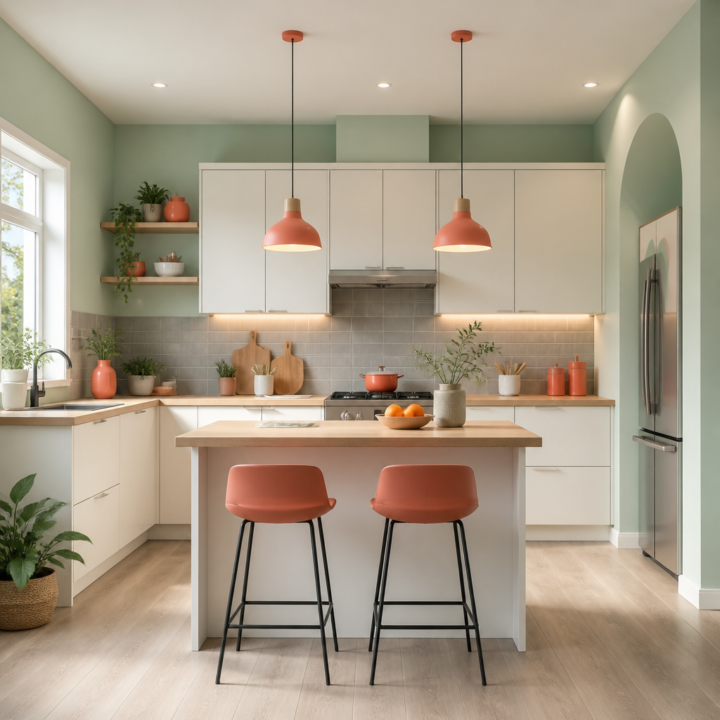
- Start by selecting a base color that will dominate the kitchen walls and cabinets, such as a soft pastel or neutral tone.
- Choose a complementary color for secondary elements like backsplashes, countertops, or appliances to add subtle contrast.
- Incorporate a bold accent color in small doses through accessories, kitchen towels, or bar stools to bring vibrancy and interest to the space. Avoid using too many colors to maintain a cohesive look and feel throughout the kitchen area. Finish by ensuring proper lighting to enhance the chosen colors and give the kitchen a welcoming atmosphere.
Following these five clear steps will help beginner homeowners create a fresh and inviting kitchen color scheme on a budget. This practical approach balances color coordination and simple design choices, making it easy to achieve visually appealing results while maximizing the overall harmony and comfort of the kitchen environment.
Matte vs Glossy Finishes

| Point | Matte Finish | Glossy Finish |
|---|---|---|
| Matte finishes provide a subtle, non-reflective surface that helps conceal fingerprints and smudges, ideal for busy kitchens. | Matte cabinetry brings a soft, elegant look without shine, offering a cozy and understated style for any kitchen palette. | Glossy finishes reflect light, brightening spaces and adding a modern, polished feel that can make kitchens appear larger. |
| Matte surfaces tend to be more forgiving with scratches and daily wear, maintaining a consistent look over time. | They do not highlight dust or grime as much as glossy options, reducing the need for constant cleaning. | Glossy finishes require regular polishing to keep their reflective quality and can show imperfections more clearly. |
| Installation and upkeep differ between finishes and can influence the overall kitchen maintenance routine. | Matte finishes typically require gentle cleaning agents to avoid damaging the surface. | Glossy finishes can use mild cleaners but need careful wiping to prevent streaks and maintain their shine. |
Choosing between matte and glossy cabinetry depends on your kitchen’s lighting, style preference, and upkeep willingness. Matte finishes suit classic, understated looks and practical maintenance, while glossy options enhance brightness and modern appeal. Knowing these contrasts will help you align your cabinetry finish with your kitchen’s atmosphere and your daily habits.
Smart Color Practices

Do:
- Choose colors that complement both your cabinetry and countertop materials for a cohesive look.
- Test paint samples on your kitchen walls and observe them at different times of the day before committing.
- Use lighter shades on walls to open up small kitchen spaces and darker hues on cabinetry for contrast.
Don't:
- Avoid overly trendy colors that may quickly go out of style and affect resale value.
- Don't neglect the kitchen's natural light when selecting colors; a hue that looks good in artificial light could feel off in daylight.
- Avoid using too many colors in a small kitchen to prevent a cluttered or chaotic atmosphere.
Adopting smart color practices can improve your kitchen's aesthetic and functionality without breaking the bank. Paying attention to natural light and thoughtful sample testing results in a welcoming and harmonious space. Avoiding common pitfalls ensures your kitchen remains stylish and comfortable for years.
Selecting the right Kitchen Color Schemes can refresh your space and boost your home's appeal without high costs. Starting with simple color choices helps ease the process for beginner homeowners, and even small changes can have a big effect. Try applying one idea from the list, save this article on Pinterest for future inspiration, and share your results with friends to spread budget-friendly home decor tips.
